ROLE
UX Researcher
TEAM
Team of 5
TIMELINE
Sep - Dec 2021
UX Researcher
As part of a group project for Indeed.com, I collaborated with four other researchers to conduct research on user experience. Our work involved various tasks such as creating a moderator script, recruiting participants, conducting moderated interviews, affinity mapping, and qualitative and quantitative data analysis. We also presented our findings to Indeed's design and research team. In total, we conducted 10 moderated tests and 2 pilot tests. During the tests, I moderated three sessions while serving as notetaker for the remaining sessions.
Heuristic evaluation
We evaluated the various aspects of the Indeed site for its functionality and usability, took and compared notes in order to identify a suitable user flow for further evaluation.
Usability Testing
We tested the identified user flow with moderated user tests via Zoom, on Indeed and two other competitor sites: Glassdoor and LinkedIn. Participants were then directed to fill out a system usability survey (SUS) questionnaire as well as answer verbal questions.
Data Analysis
After conducting the usability test and data collection, we analyzed the quantitative data from questionnaires with statistical methods.
On the other hand, we sorted out the insight and points from the interview notes to an affinity diagram on Figma.
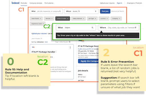
We identified potential usability problems in Indeed’s official website on desktop device through Heuristic Evaluation. We followed Nielsen Norman Group’s 10 Heuristics for UI Design.

Here is the summary of Heuristic Evaluation
Areas of Improvement
Consistency and Standards - Buttons and phrasing styles are inconsistent across the website and this can cause confusion.
Visibility of System Status - The layout of some elements on the Indeed website are awkward and inelegantly laid out - this results in the suboptimal use of whitespace on the site
Flexibility and Efficiency of Use- The application format is restricted in many steps. Flexibility for customizing conditions for job seeking and notification are limited.
Recommendations
Offer users the option to filter their actions - Give users the ability to filter the qualities of the job (pay, location etc.) that they are searching for on the landing page as well as the type of job that they want to be notified through email for
Style site elements consistently across the site - Have elements such as buttons and suggestions be standardized across the site in order to minimize user confusion or error
Moderator Script
We outlined the moderator script in a following way-
Overview
Rules of the road
Tech-setup
Persona Reading
Instructions
Task-1
Task-2
Task-3
Post Comparison
Recruiting Participants
We recruited eligible participants through a screener survey. Our participants were categorised into two groups - Students and Non-Student.
Testing Sessions
Each Session was around 45 mins. We asked participants to perform three tasks on three different job seeking websites: Indeed, Glassdoor and LinkedIn. All three tasks were the same. Our aim was for the participants to intuitively use the filters provided on each site to filter through their search results.
Categorization
To understand the qualitative data from usability testing, an affinity map was created by categorizing feedback into three different job search sites.
Indeed-specific Feedback
Feedback on Indeed was further divided into three categories - "to be improved (filters), to be improved (others), and doing well", revealing that users experienced frustration and confusion while using the filter function on Indeed.
Commonality in Comparison
Participants had a lot of common feedback when asked to compare the three sites, which was also reflected in the affinity map.
SUS Analysis
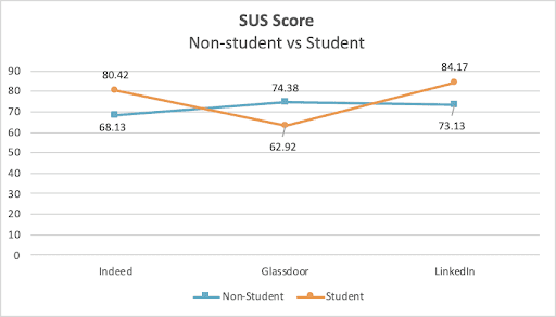
LinkedIn got the highest SUS score; Glassdoor got the lowest.
The interesting part is that, although Glassdoor got the lowest SUS score in average, P1 and P3 gave Glassdoor the highest score.
Participant Demographics
After analyzing P1 and P3, we found out that they are from the non-student group.
SUS Analysis by Group
However, after we separated the values into Non-student and Student group, we found out that those two groups showed a totally different trend. Glassdoor got the highest score in Non-student group but got the lowest in Student group
We found out that welfares and salaries are being considered more by non-students (full-time job seekers) than students, which Glassdoor handled them very well, so we got different trends along the groups

SUS Overview
Positive feedback
Emphasis on clean and minimalist user interface to avoid clutter and information overload.
Conspicuous and intuitive filters to make searching easy for users.
Skill-set filters offered as a unique feature to set the website apart from its competitors.
Search results are easily accessible without requiring users to sign up or log in, preventing frustration and potential abandonment of the site.
Negative feedback
Search results do not accurately match the filters selected by users, resulting in irrelevant job postings being displayed.
Job descriptions on the site could be better organized, as there is currently a lot of information packed into a small card.
The filters could be improved in terms of accuracy, completeness, and user-friendliness.
Suggestions for improvement
Allow users to select multiple options in filters, such as multiple company or location preferences.
Ensure that search results accurately match the options selected in filters to prevent irrelevant postings from being displayed.
Allow a sliding range for preferred salary amount, rather than just offering static options.
What can I do better
Randomize the order in which participants test the sites to avoid order bias, where respondents may be more likely to favor objects based on their position in a list or sequence.
Increase the number of participants in the usability test to obtain a larger sample size and gain more statistically significant insights.
Based on the persona, simplify the amount of information presented to users during testing to prevent overwhelming them with information they feel obligated to use in the user testing.
What have I learned
Through my first full-fledged UX research project, I became familiar with the research process and various methodologies such as benchmarking, heuristic evaluation, and testing moderation.
Technical checks are often overlooked but are a crucial part of the usability testing process.
It is imperative to ensure that participants' equipment is functioning properly and compatible with what they will be user testing.
Technical checks also provide an opportunity for participants to 'warm up' to the process and for researchers to initiate rapport with participants, making the actual user testing experience less intimidating.
Mayur Salunke, 2023


